Store collaboration with
nortstudio
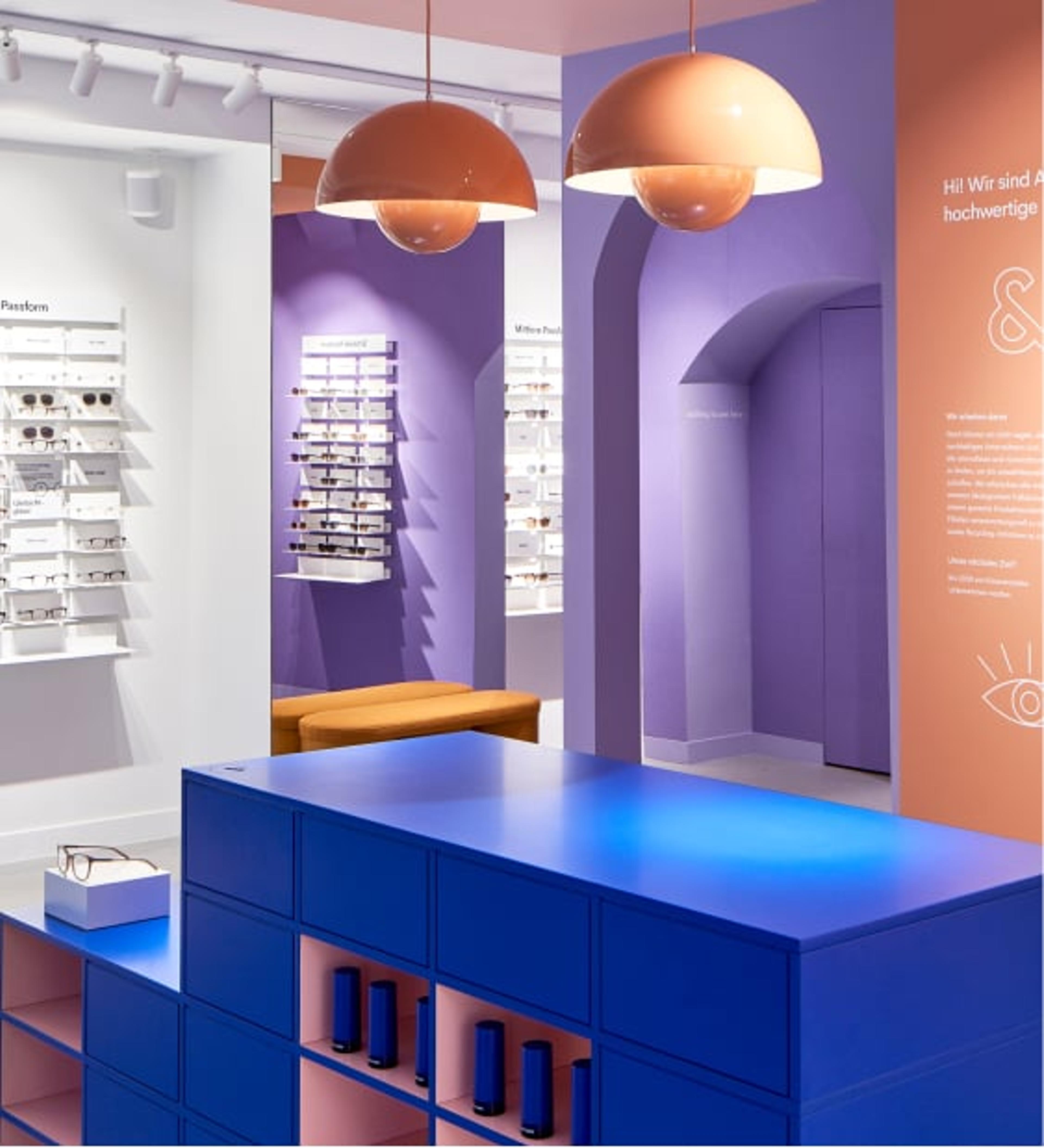
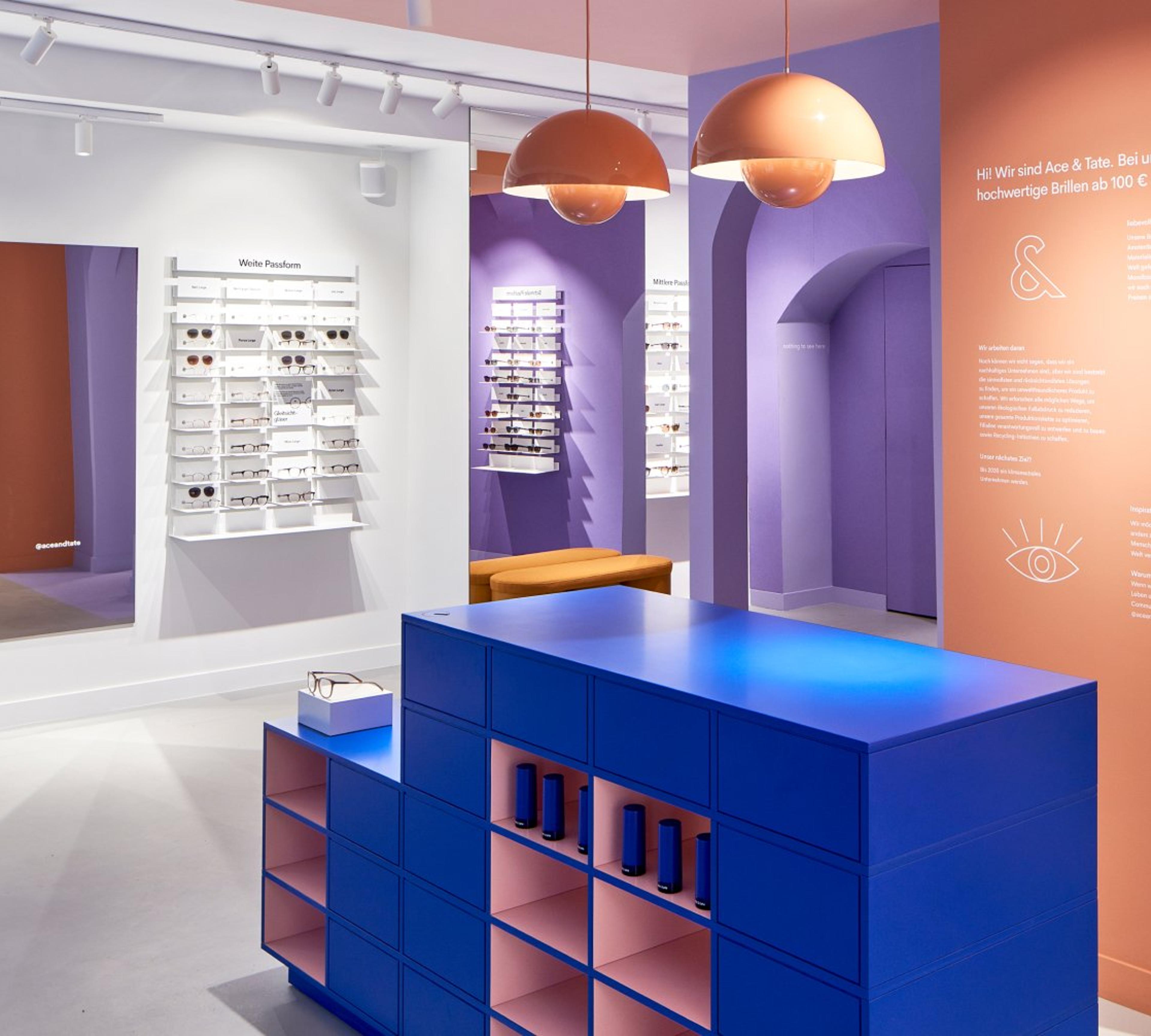
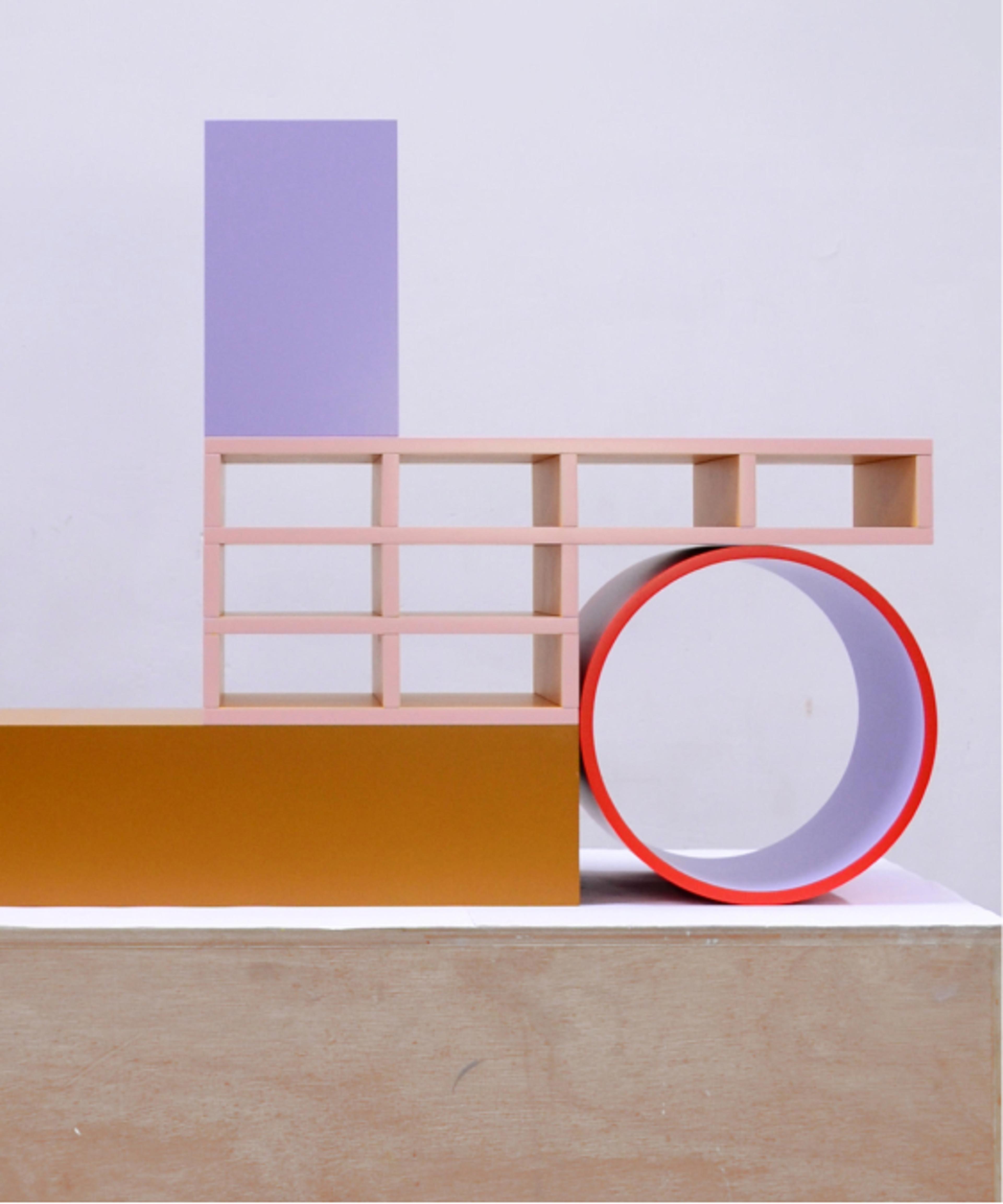
Together with like-minded creatives, we’re using our stores to stage fresh perspectives on retail design. For our third Cologne store, we worked with nortstudio. The design duo creates furniture and accessories that have colourful, graphic volumes — blurring the lines between two and three dimensions.
Meet the designers
Urban, bold, joyous design — nortstudio is all that and more. Meet Jef De Brabander and Kathleen Opdenacker, the couple behind this studio. To explore a mutual love for working with their hands and manipulating materials, they founded nortstudio back in 2016 in Antwerp.
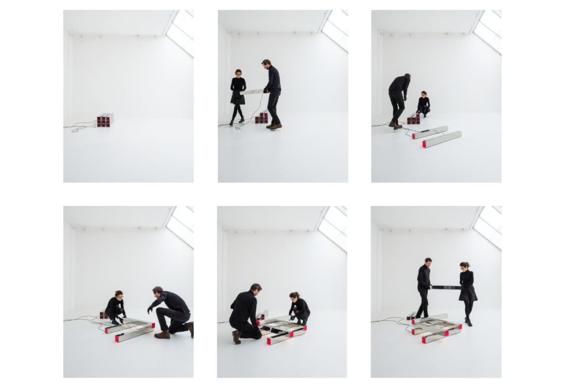
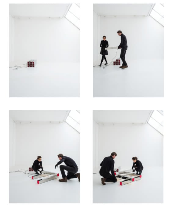
(Ace & Tate) Tell us a bit about how you work together, what’s your secret?
(Nortstudio) Having different backgrounds is definitely an advantage. Kathleen is trained as a graphic designer, with an eye for expressive colours and geometric shapes. Whilst Jef is an industrial engineer with craftsman’s skills that brings drawings into three-dimensional objects.
“All that inspiration is then filtered through an intuitive process of hands-on studio experimentation.”
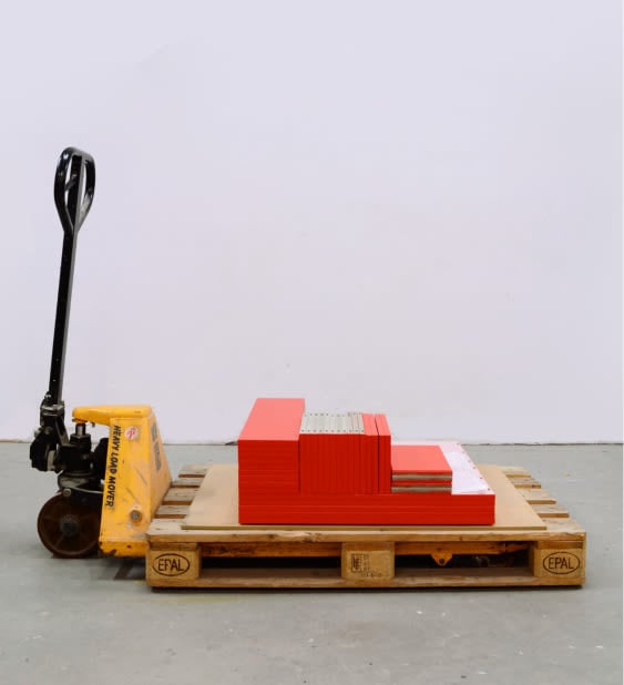
Where do you get inspiration?
Our work draws inspiration from the structural details of architecture, the daring shapes and palettes of Italian design, and colour combinations sourced from paintings and fashion magazines. All that inspiration is then filtered through an intuitive process of hands-on studio experimentation.
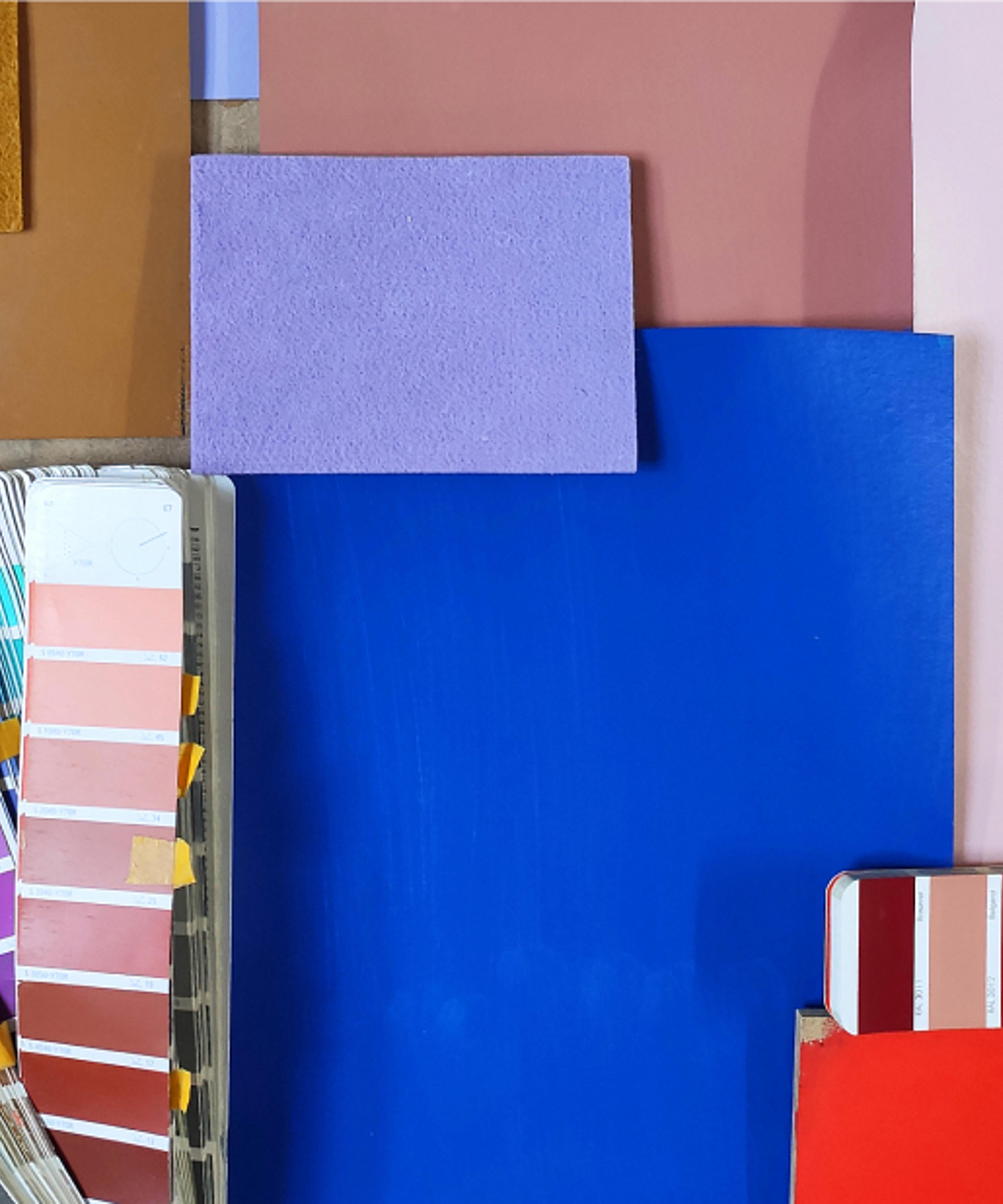
the process
With its quirks and unexpected shapes, the original space of our new store had nortstudio written all over it. We asked them to create custom furniture that complements the raw architecture — let’s dive into the process behind it.
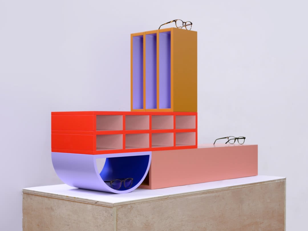
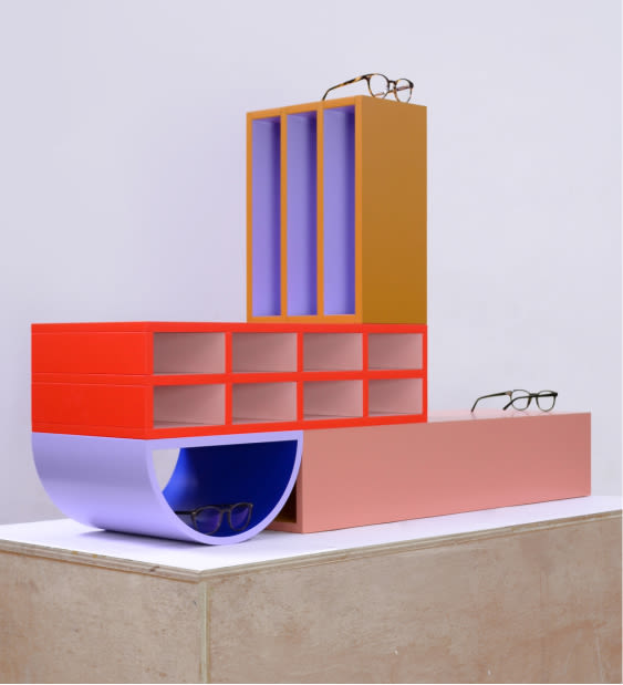
What made you think — yep, we really want to work on this store?
First things first: we're big fans of Ace and Tate. We worked together to deliver furniture for stores before. But this time, we were asked to create furniture from scratch with a venue, a context, in mind. Designing several objects that added up to a bigger picture was new and exciting for us.
“We look for expressive forms — with a preference for pure and simple geometric shapes.”
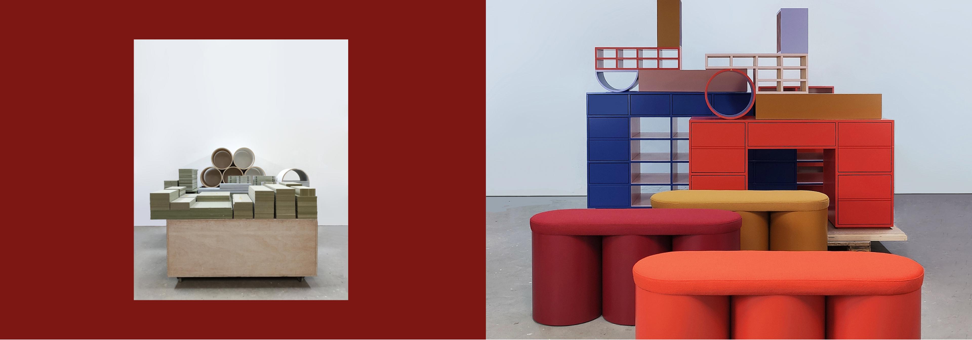
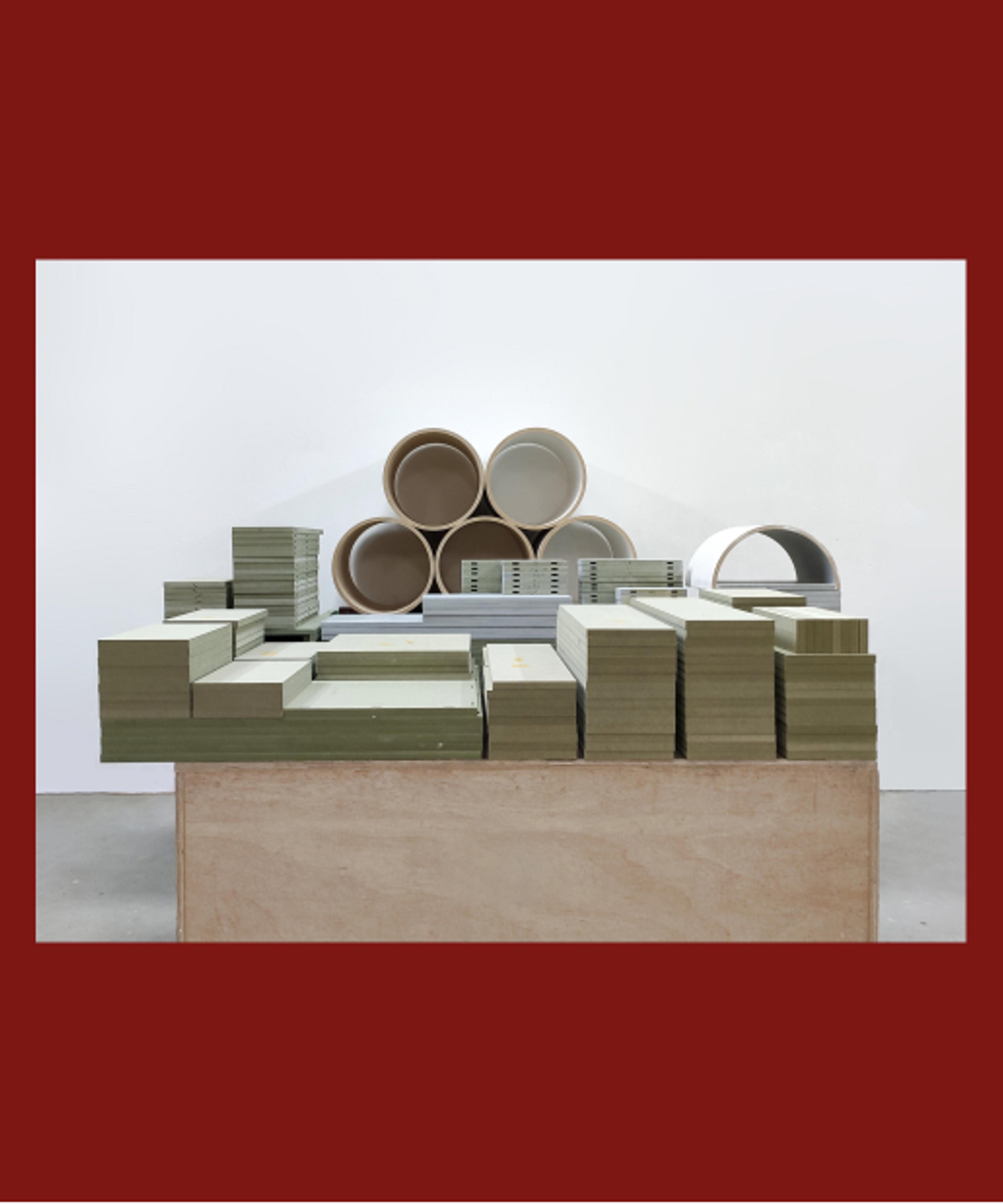
Talk us through your creative process, how did the furniture come to life?
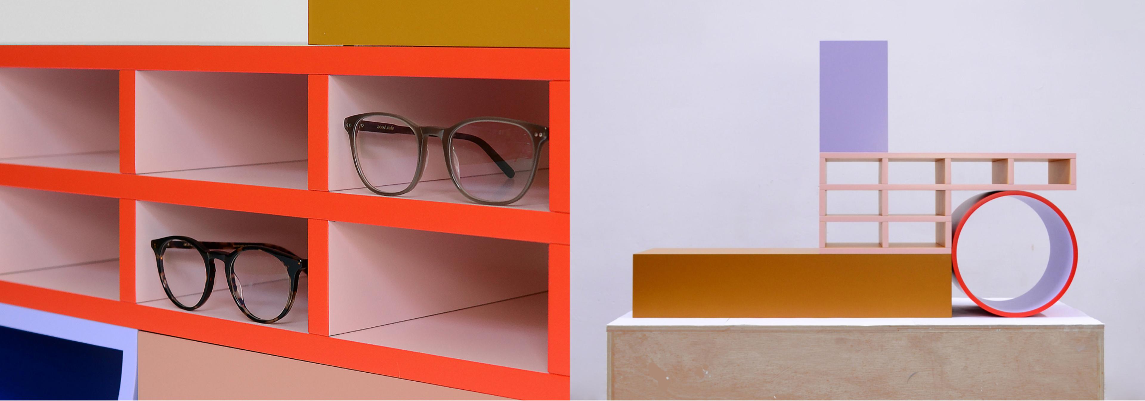
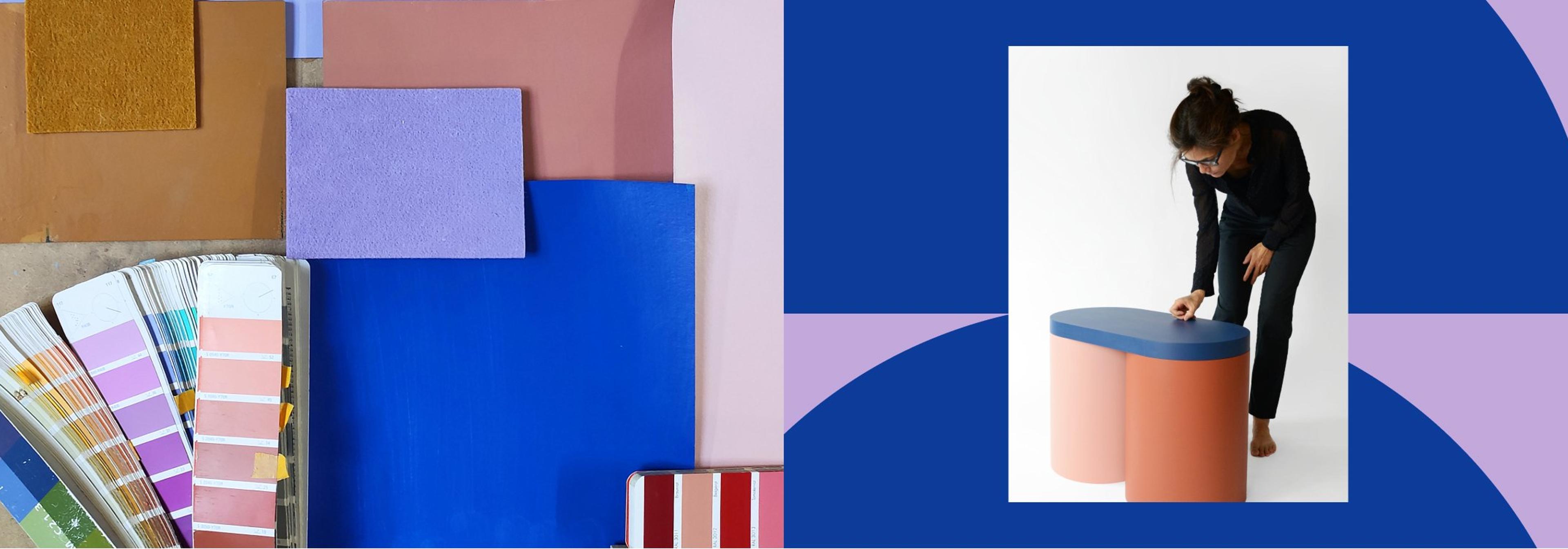
We created a design concept that starts with choosing the right, in-house stock materials. Then we look for expressive forms — with a preference for pure and simple geometric shapes. The forms can also help us define what materials we use and the colour is defined afterwards. This doesn’t mean colour is any less important, we see colour as part of the object and makes the design stronger.

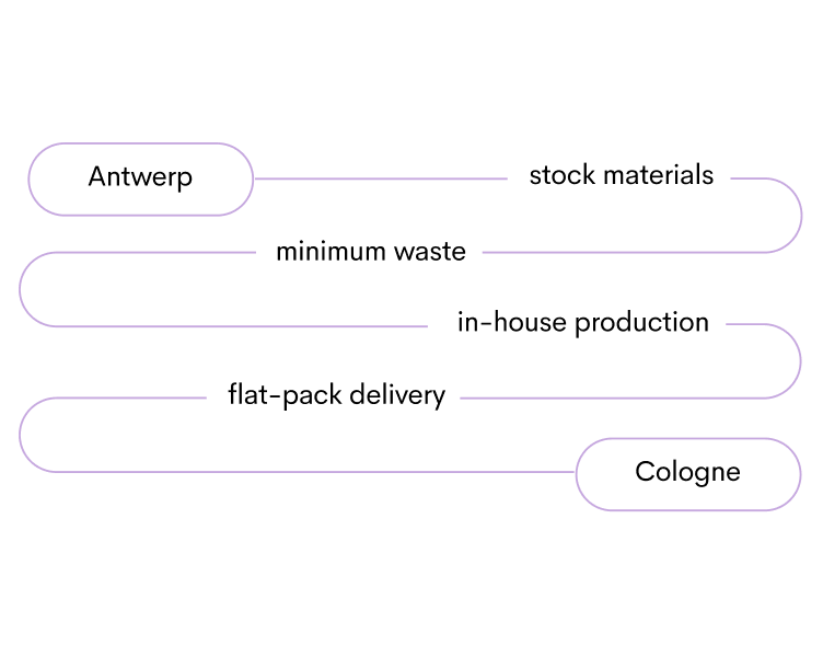
The design concept
We love the vibrant palette you’ve used, how does your distinct eye for colour come about?
Our approach is very intuitive at first. The colour palette should resemble a certain feeling we have for the object. Sometimes colours used in a painting, a photo in a fashion magazine or an object (composition) in real life is the first step to choosing colours. Next, we spread colour samples out on our table, and we begin to combine them until we feel good about it.
Of course, what looks cool on your screen looks even better in real life. So come on over to our Cologne store on Severinstraße and check it out IRL.
All photos by nortstudio.
